The Future Of Lovers – A Publication
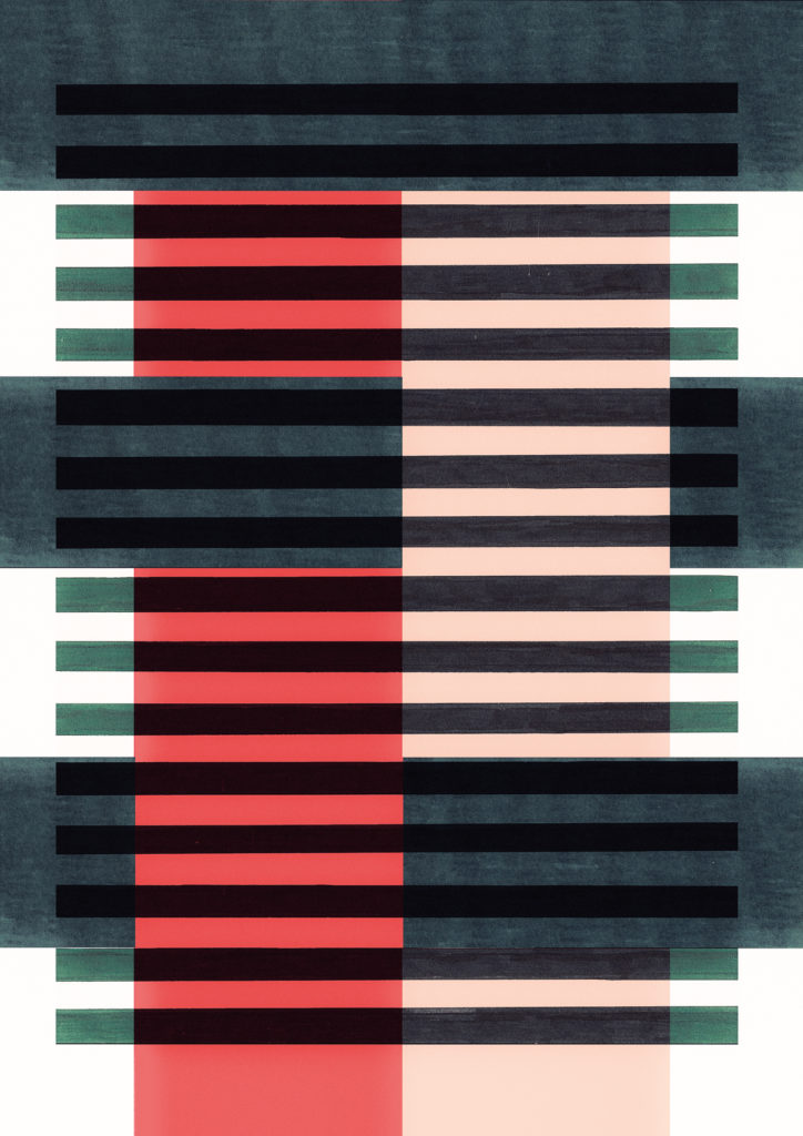
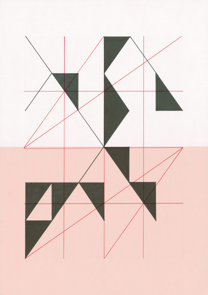
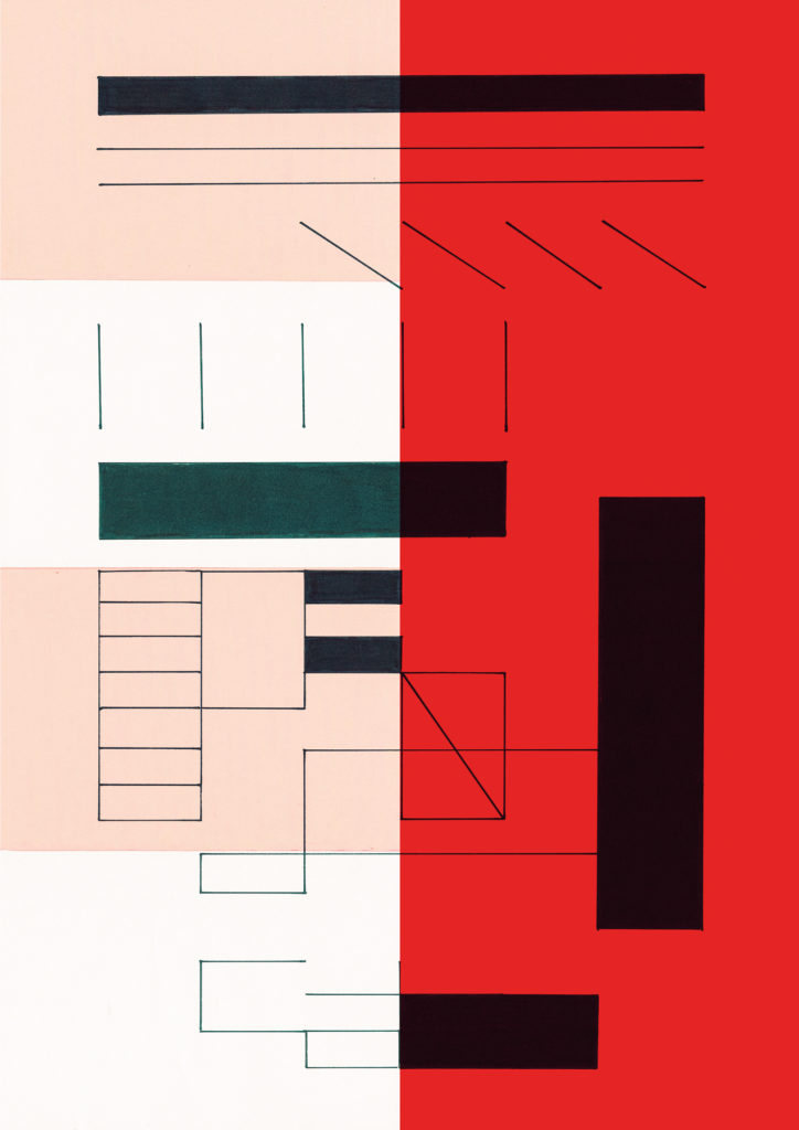
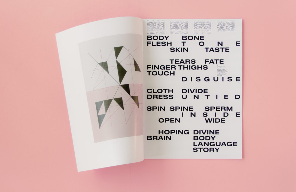
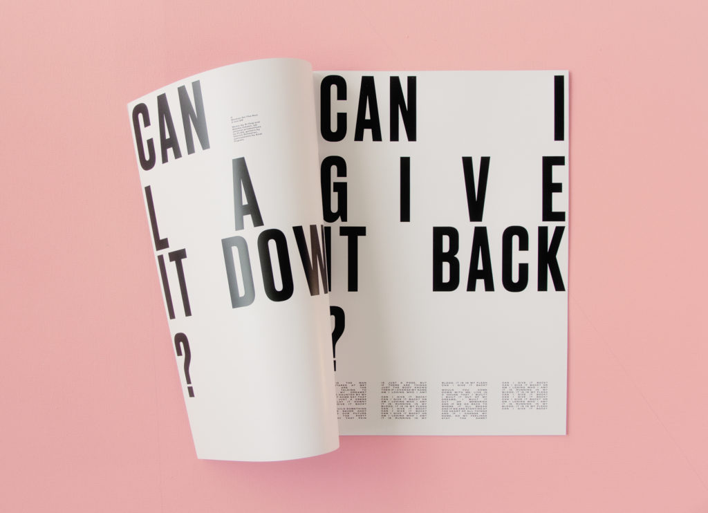
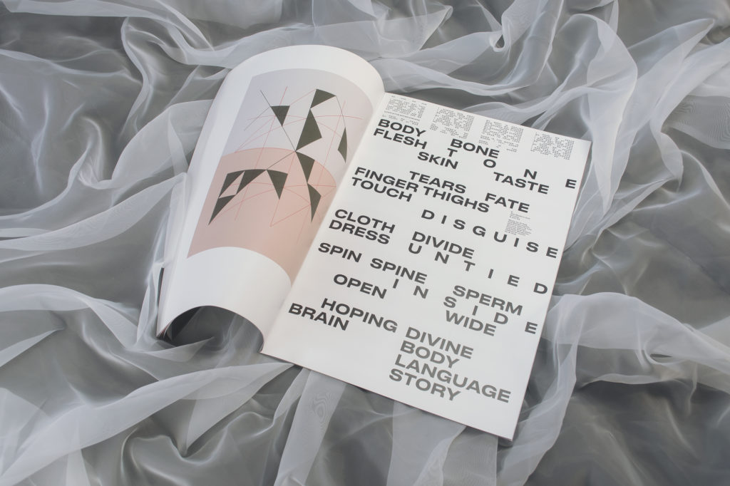
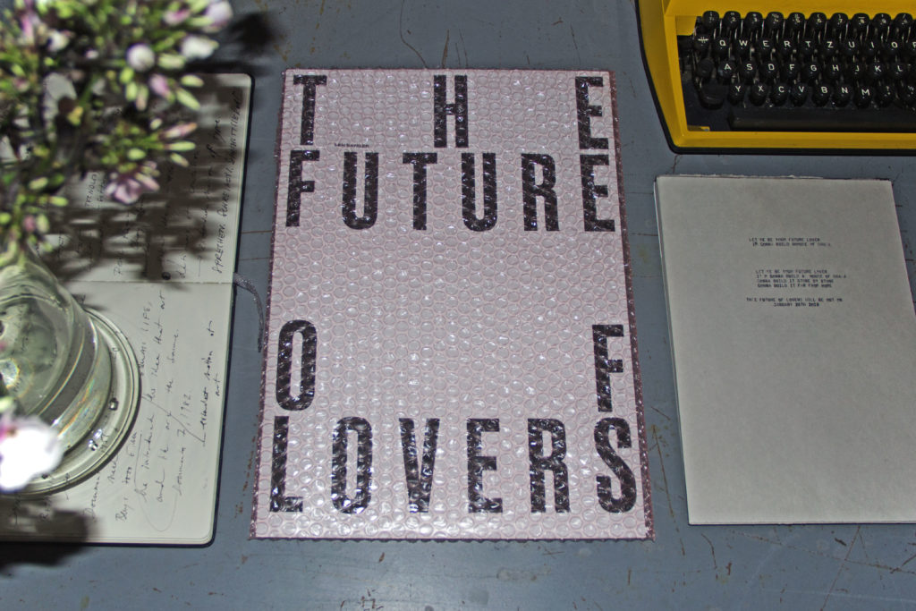 Just earlier this year, Len Sander released their second album ‘The Future Of Lovers’. Now, they are extending their musical universe by adding a visual and touchable experience in form of a printed publication (A3 format). The publication combines the lyrics from the album with the strictly geometrical drawings by the band’s singer Blanka Inauen and photographs by Sonja Berta. It was designed by graphic designers Lea R. Fischlin and Andreas Hänggi who managed to convey the rhythm, the sensuality and the wideness of the album.
Buy the Publication
An Interview with singer Blanka Inauen and graphic designer Lea R. Fischlin
Why did you want to make this publication?
Blanka: When we started talking about producing a second album for Len Sander I knew quite early in the process that I wanted to do something visual and touchable that goes with the music. The reason for this was that I am constantly trying to bring different interests of mine together: Writing music and lyrics, performing as a singer, working in visual arts etc. And I see everything that comes out of these processes as symptoms of the same basic ideas.
What are these ideas?
Blanka: Before we started working on the music for The Future Of Lovers, I was thinking and reading a lot about the supposed division of body and form as opposed to brain and content. There’s a very widespread notion in our society of the body as something separate from the mind: the body as machine, as image, as material controlled by and subordinate to the brain. And the reason that I was so motivated to learn about this subject was because I personally felt this separation and suffered from it. So I was in the midst of this learning process of body-awareness when I wrote the lyrics for this album and collected the ideas for it. This body-awareness is really at the heart of the album and to accompany the music with something visual, touchable and sensual just made sense.
The publication combines the lyrics from the album with drawings and photographs. Tell us something about the drawings.
Blanka: In the drawings I wanted to find new forms strictly based on existing ones. I followed a very banal and simple principle: A sheet of paper is a plane surrounded by four dots given by the corners and four lines given by the sides. By connecting and dividing these given dots and lines new forms almost automatically emerge. I think that the forms and formats that are given to us very strongly influence our thinking. But I am also always trying to transform what I get from the past and from what surrounds me.
Who did you work with for the photographs and why?
Blanka: I worked with Sonja Berta who is a photographer and artist and also a dear friend of mine. When I talked to her about the concept of The Future Of Lovers she was so excited and enthusiastic that it was obvious that I would work with her. She understood my concept of sensuality and bodily experiences very quickly and developed her own ideas on it.
How did the idea for the photographs develop?
My idea was to work with lots of textiles. There’s no material as close to our bodies as textiles, since we are wrapped in them almost all of the time: clothes, blankets, sheets, towels. And I think this is the reason why it so strongly evokes sensuality. It was then Sonja’s idea to go into water and I immediately liked this idea because water is such a strong symbol for the beginning of things, for the memory of where we come from but also for the mysterious and unconscious dimensions of our psyche.
For the graphic design you worked with Lea Fischlin and Andreas Hänggi. Why is that?
Blanka: We just loved their work. I generally think it is important to bring new perspectives to your own work and let your ideas travel and be transformed by other people. Of course it is always a risk and it’s not easy to let go when everything you work with is so personal and intertwined. So I was really happy when I realised that Lea and Andreas immediately understood my approach.
Lea, what was the concept that defined your work for this publication?
Lea: First of all, we wanted the publication to be an extension to the album and a possibility to dive deeper into the world of The Future Of Lovers. The design should reflect the rhythm, the sensuality and the wideness that the songs from the album convey. This is why, in a first step, it was important for us to get to know the music really well. But then, in a second step, we really focused on the written word, the lyrics, instead of the music. While organizing the text fragments in a grid, we wanted the characteristics of the different songs to be perceptible and still be able to capture the album as whole and to contribute to kind of a Gesamtkunstwerk. We also wanted that our design concept had a strong connection to Blanka’s drawings. And this is why we worked closely with her in the elaboration of the grid, as she worked closely with us for the elaboration of the drawings.
You chose quite a peculiar packaging. How did you decide on this?
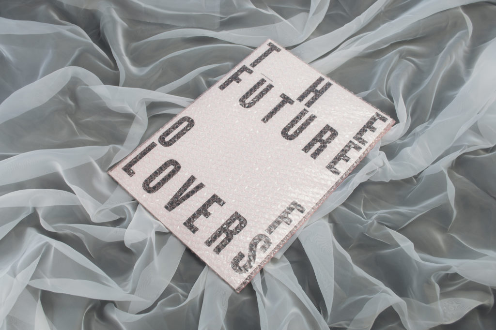
Lea: The packaging should on the one hand create some suspense and raise the expectations for the content of the publication. On the other hand, it connects to the theme of the album: The Future Of Lovers is wrapped in a pink, airy, light cushion, like dreams and visions for the future that are fragile and easy to burst.
The publication is unusually big. Why did you choose such a big format?
Lea: We chose a really big format for the publication so that the reader can fully dive into the world of this album and its artwork. Also, our concept was to create a publication that can be unfolded so that the single pages can be used as posters.
